Responsive design tips
More responsive design tips will be coming soon, as we are updating this section.
A few simple things you can do to create attractive responsive sites on our platform
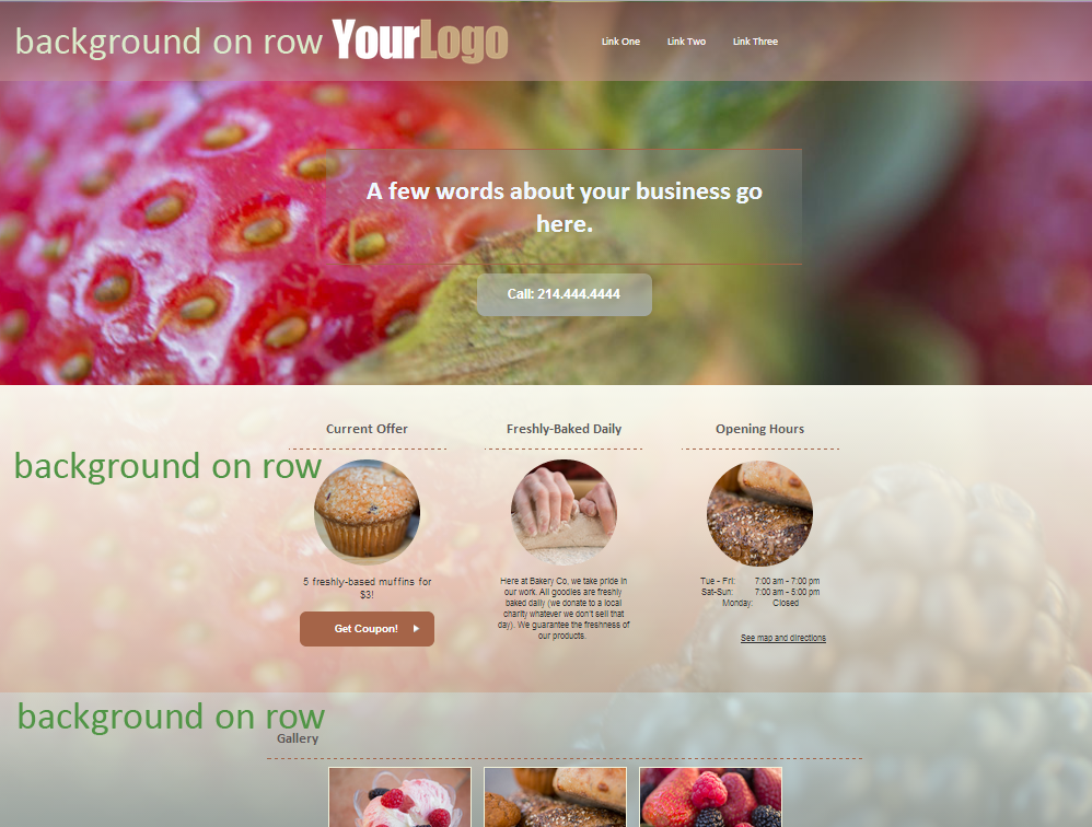
1. Add an image as a background to a page. We’ve added a few large images to our image library, or you can upload your own.
We have a new background option – “cover” (will cover the entire page with one image, while retaining proportions and scaling as needed), this background option works well for responsive sites (see screenshot below).
2. Add a background color or gradient to rows (you can make it semi-transparent). That adds visual separation to content:
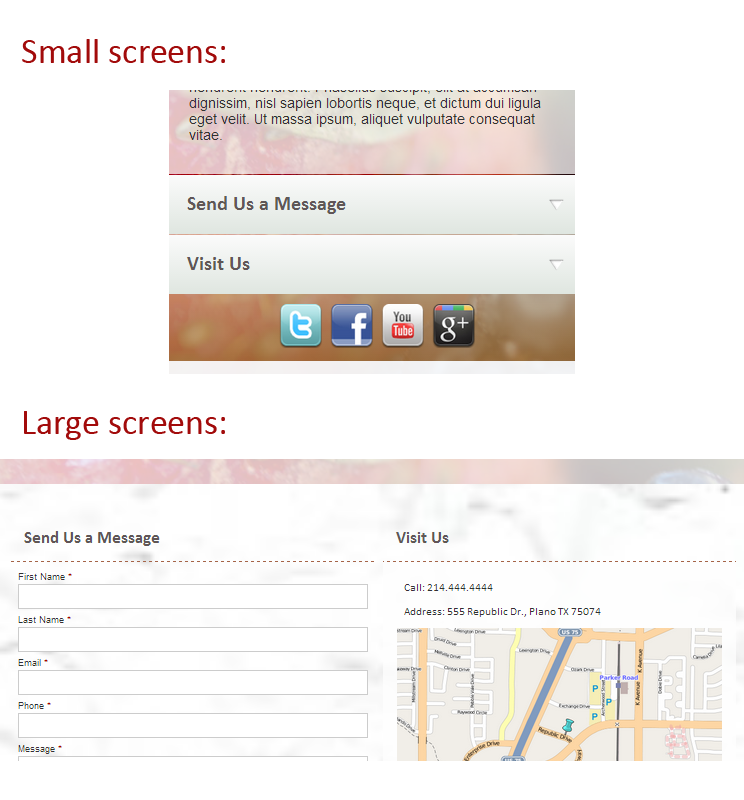
3. The “button” look works great for mobile devices, yet may look awkward on desktops. In the styles for the large screen version you may want to remove the backgrounds for Headers and certain Link Buttons, and instead leave them as plain text (possibly with a border underneath):
4. For larger screen – add more spacing between elements. By default our platform sets a 45px margin on rows for the large screen version. You can set additional margins or paddings around containers, rows or widgets, as needed.
Happy designing!