Header navigation menu (top links)
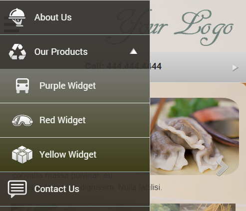
Header Menu widget can typically be added at the top of the website pages to display the navigation text links and an optional logo or a header image. On small screens (or for mobile-only sites), the header menu icon triggers a dropdown with the list of links:
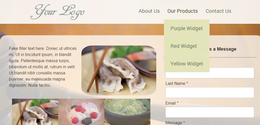
On large screens (for responsive pages) the Header Menu displays the logo / header image along with the list of links:
Add the Header Menu widget to your page in Page Editor. In the Header Menu Edit screen you can customize:
- the main header / logo image, and how you’d like for it to be linked (the typical scenario would be to link the logo to the home page of the website)
- the width of the image relative to the menu links (separate settings for small and large screens)
- menu icon, and its alignment (right or left) relative to the main header / logo image
- the style of the mobile menu (slideout or overlay)
- add navigation text links and sub-links (with optional icons next to each link):
Header Menu styles: slideout and overlay
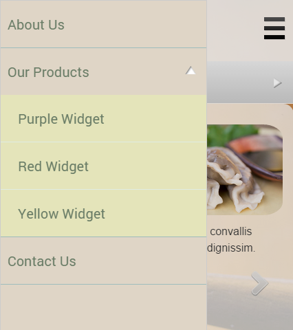
You can select between two Header Menu styles: slideout and overlay. With the slideout option when a visitor clicks on the menu icon, the menu slides out, partially covering the screen:
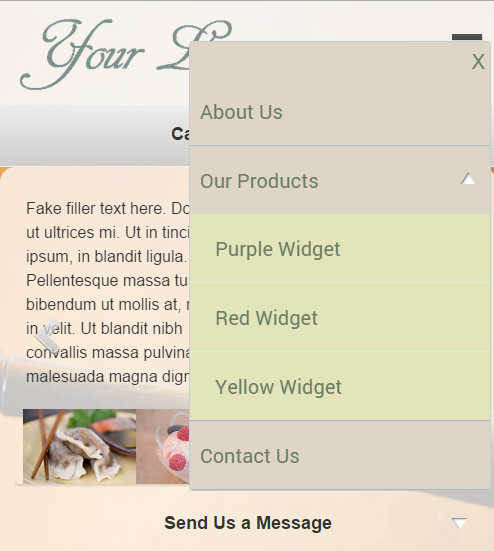
And here is what the overlay menu style looks like:
Adding submenus to the Header Menu
To add a submenu to a link, in the Link Edit screen select the option “Open Submenu”:
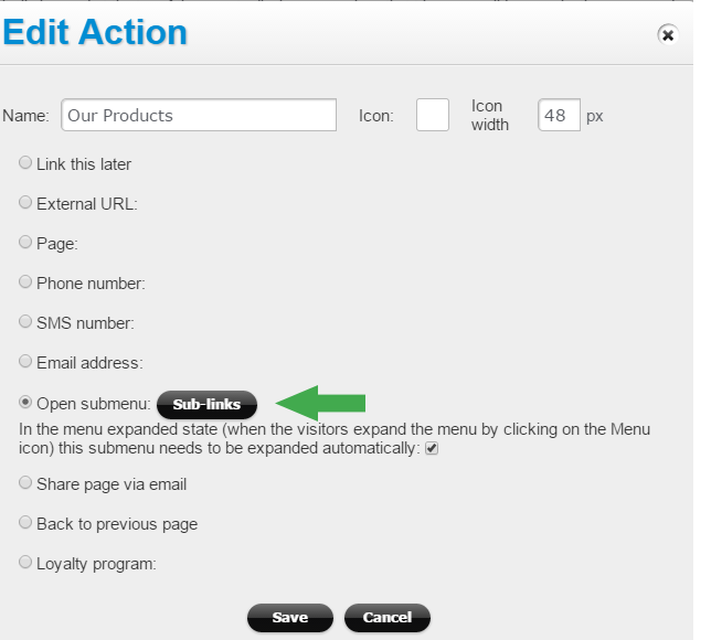
With this option the button for Sub-links becomes available.
For sites with multiple pages you can click on “Add to reusable widgets” link to add this Header Menu to your widgets library (to be added to other pages later, eliminating duplicate work in having to recreate this widget.)
Adjusting Header Menu visual settings
To customize the menu visually (change background options, link border style, or font options), click on the Style icon next to the Header Menu widget (in the Page Builder):
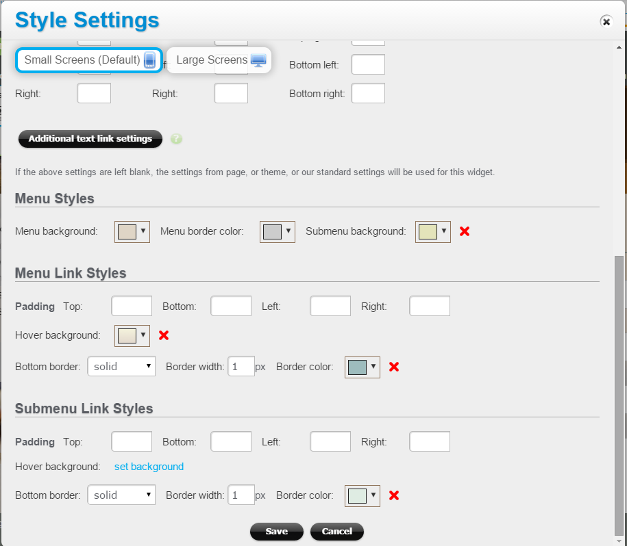
Make sure that the tab “Small Screens (Default)” is selected at the top. The visual settings you specify here will apply to the large screen version also (where applicable). For example, the Submenu Background setting will be used for that submenu overlay on large screens.
To change the styles of text links (customize the font type, size, color, border style, and link hover styles), click on the “Additional text link settings” button. See this article for more information.
