Creating custom buttons
Custom buttons are typically created by adding a Link Button to a page, and then adding a background to the button (color, gradient or image), rounded corners and padding.
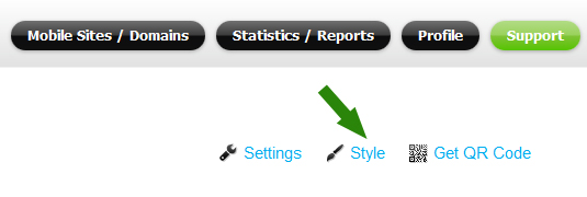
In the Page Editor, add a Link Button to a page, and click on the Style icon to open the Style Edit window.
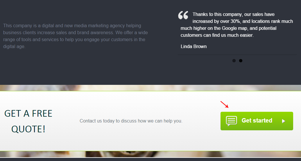
Note the custom “Get started” button created for a responsive page using the Link Button widget:
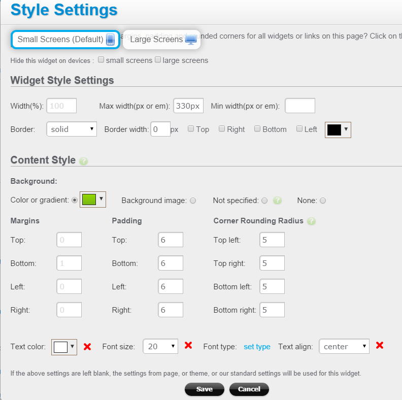
And here is the screenshot of the Edit Styles window for the above Link Button (see how the background gradient, padding and rounded corners are set here):
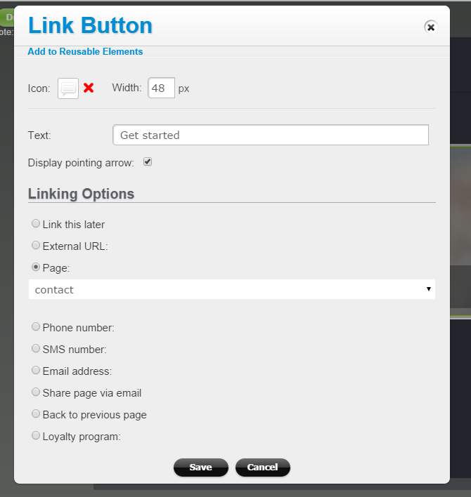
To set the button text, action (tap-to-call, link, email sharing, etc), icon image, and to toggle the arrow display, click on the Edit link for that button to open the Link Button edit screen:
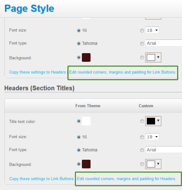
Note: to set the same style for multiple Link Buttons on the same page, you can do so in Page Style window (click on the Style link at the top of the Page Builder):
and add rounded corners, margins and padding to all the links buttons and headers on your page: