Article: the basics of building responsive websites
1. A page can be built as responsive or mobile-only. To build a responsive page, you can either
a) convert an existing mobile page to responsive:

or
b) build a new responsive page based on one of our new responsive templates, or from scratch:
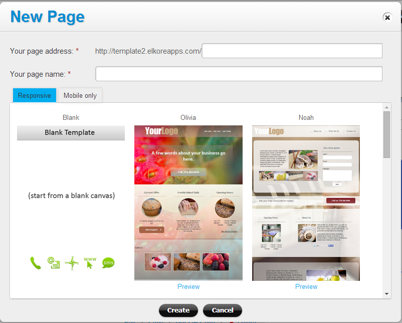
Note: when you convert an existing page to responsive, the responsive copy of the page will be created, on a temp URL. The live mobile-only page will stay as is, until you make the responsive page live.
2. Add page blocks to a page to simplify the process of creating common page sections. A “page block” is a common page part, such as a page footer, page header, a section with three columns, a section with two columns, or a section with a landing form. Mouse over a page block in the widgets library to see the preview:

Once you add a page block, you can add, remove or replace components in it, move the components around as needed and change their style and content.
3. To move items on the page, mouse over the item to see the up and down arrows. Click on the arrows to place the item before or after the previous item on the page:
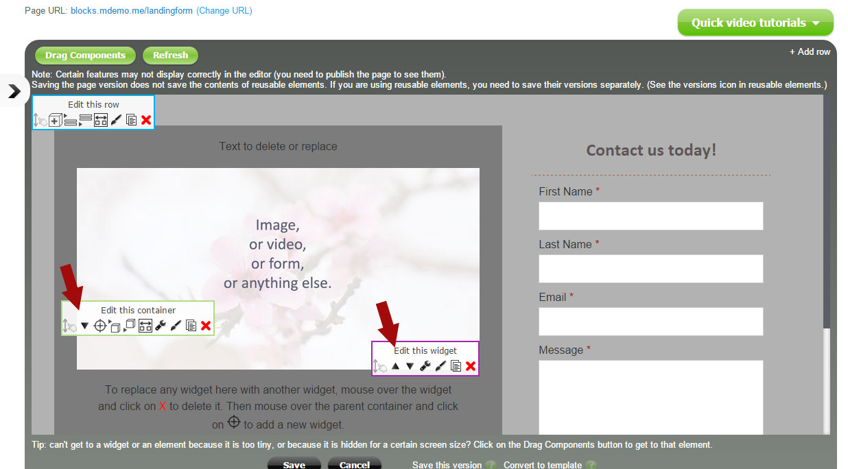
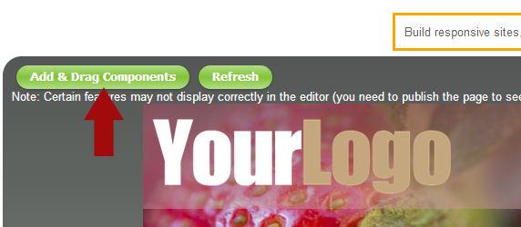
For moving items across longer distances (e.g., from the bottom to the top of the page), you can enter the draggable mode by clicking on the Add & Drag Components button at the top of the editor:
4. By default each widget is added to a container and a container is added to a row. To display multiple widgets (or containers) next to each other (on the same row), place them on the same row and set the width of the elements to a percentage that makes them fit on one line (e.g. as 50% and 50%). Items on one row will try to display on the same level, if their width permits. Please take a look at how the elements’ width is set on a screenshot below:
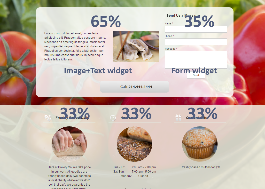
There are two ways to set the width of the elements:
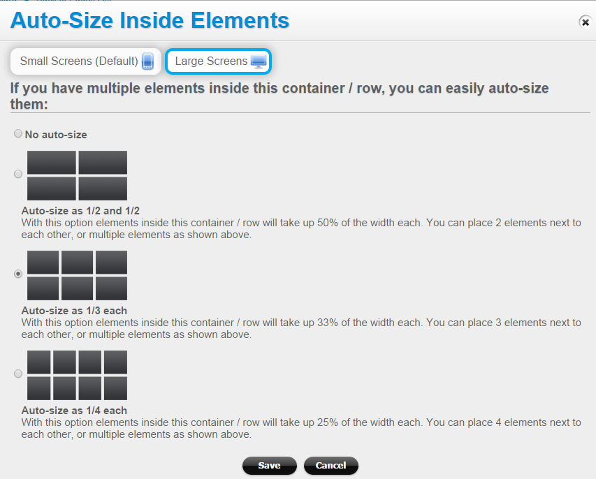
- By using the “Auto-size” function. The “Auto-size” function sizes all elements in a container or row automatically to a few popular width options (such as halves or thirds). Mouse over the container (or row) for the edit icons to popup, and click on the “Auto-size inner elements” icon:
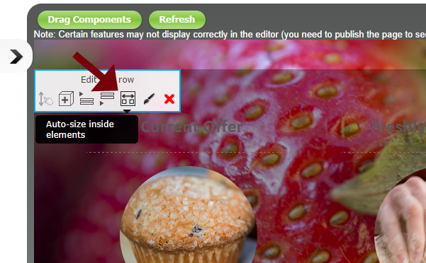 Then set the width of the elements to one of these options:
- Or, you can set the width of an element manually, by clicking on the Style icon next to the element (see the screenshot below).
Note: you may want to display multiple elements next to each other (on one line) on large screens, but one under the other on small screens. To do that simply set the elements’ width to a smaller % for large screens, and leave it at a 100% for small screens (more on that below).
5. Styles can now be added to containers and rows (in addition to widgets and a page itself). For best results you may want to create additional styles for large screens (e.g. extra spacing between elements, place elements next to each other, remove some of the “button” look that works great for smart phones but looks awkward on desktops). To add separate styles for large screens, simply click on the Large Screens tab in the Style Edit window:
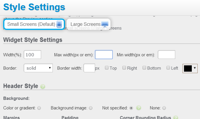
Note: mobile/small screen settings have priority (a small screen style setting will apply if no large screen setting is created!).
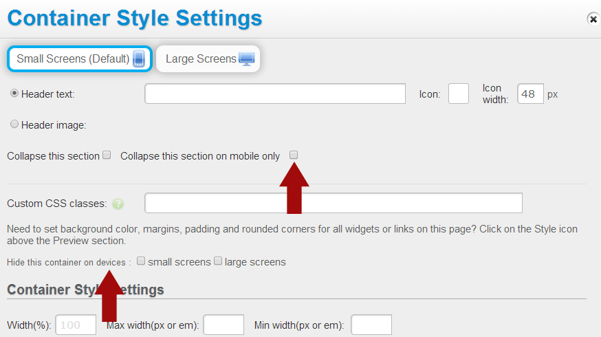
6. Containers can be collapsible (accordion-style). Add multiple widgets to the same container if you need them to collapse and expand in one section. Also, containers and widgets can be collapsible on mobile devices only and not on large screens (and vice versa).
You can hide elements (containers, widgets) on large or small screens, if you don’t want that content to be available on certain devices:
